UI Tips
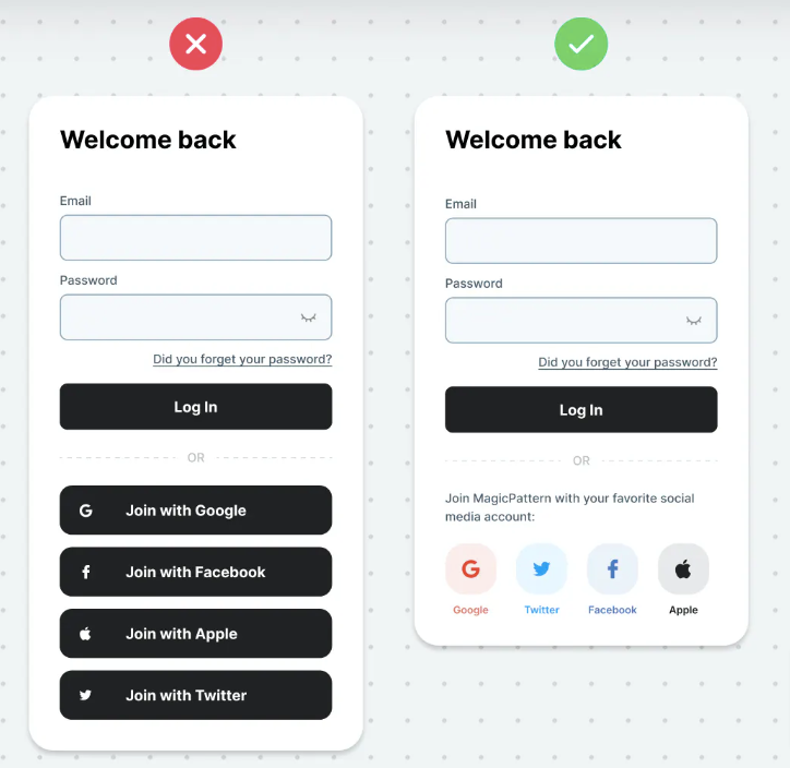
Social login
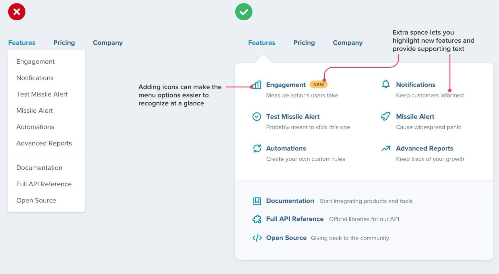
Better Menu
Dropdowns can be more than just a boring list of links. They're just boxes, you can do anything you want with them
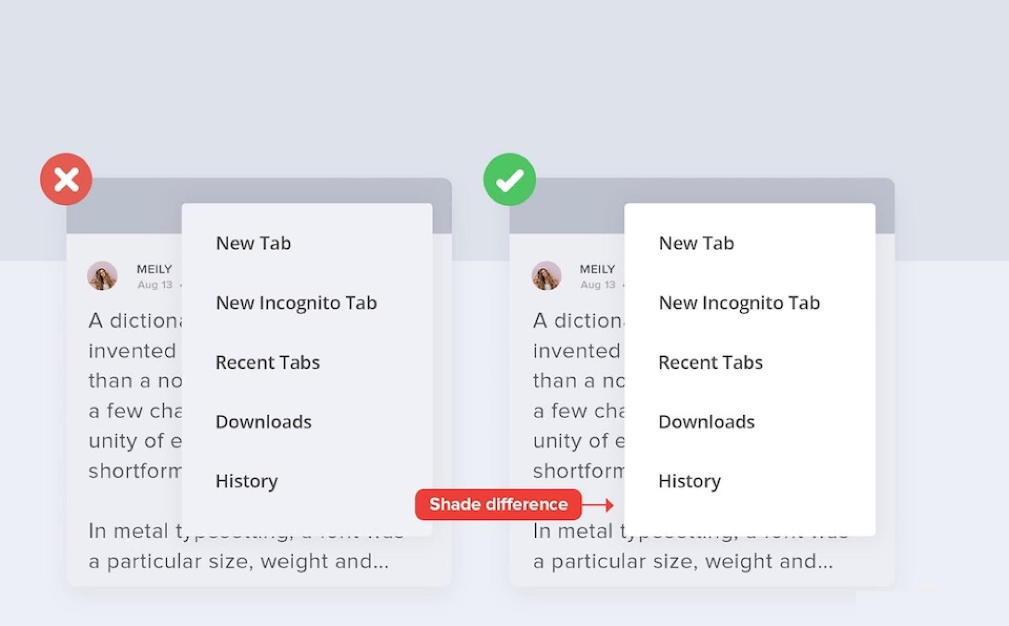
Keeping the second layer such as a drop-down atleast 2 shades(or tints) different than the background helps in creating visual prominence
Delete Modal
Make the action clarified
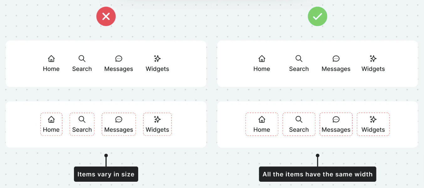
Align Uneven Elements
All items should be aligned in a same width
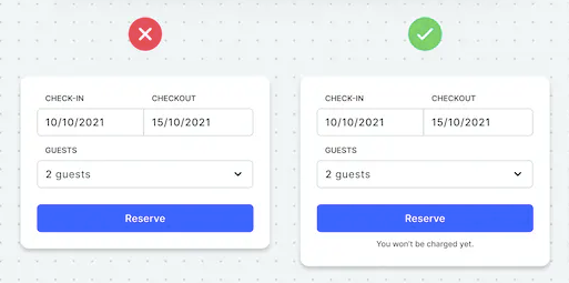
Inform Users Beforehand
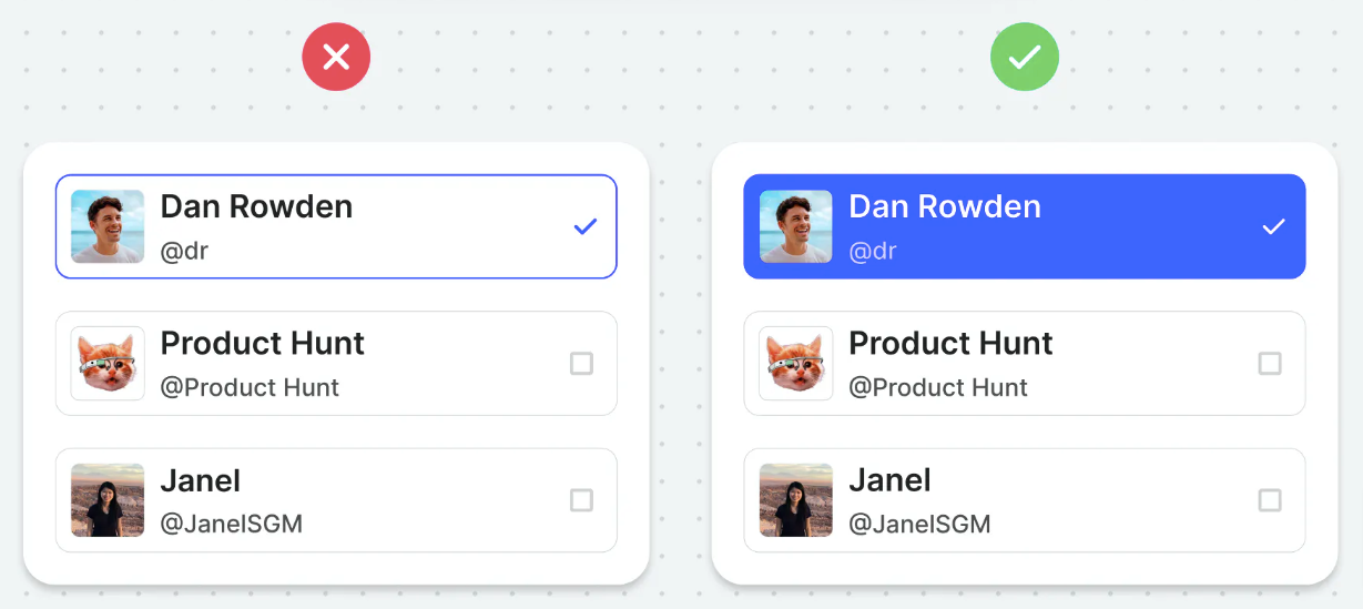
Distinguish Selected Items
Distinguishing selected items will help in creating visual prominence.
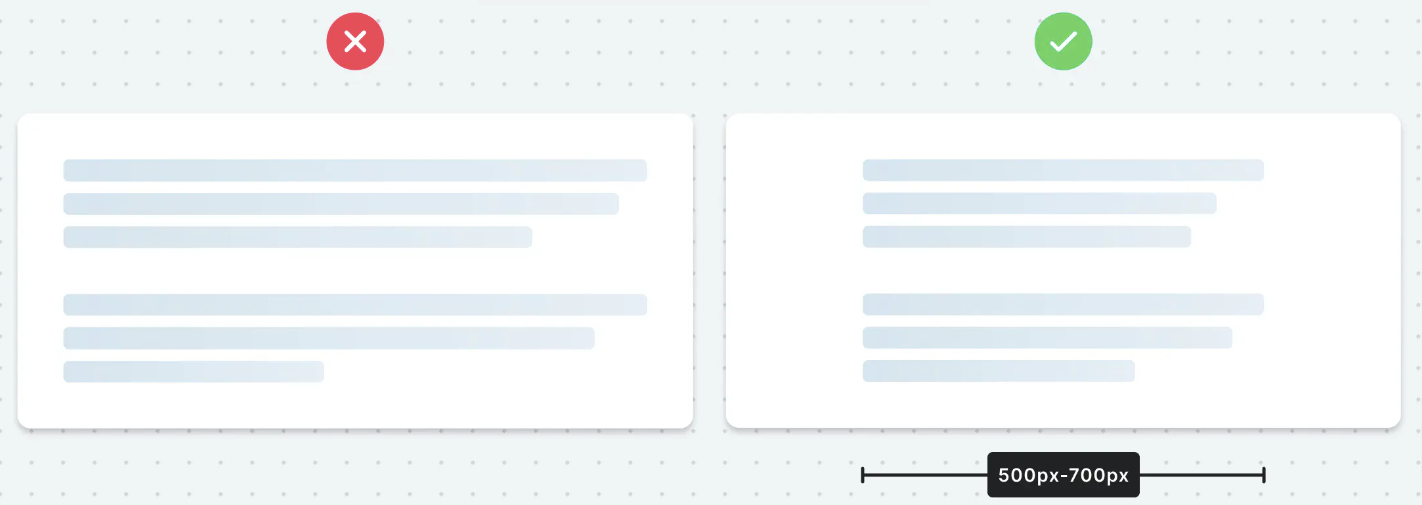
Avoid Fullwidth Paragraphs
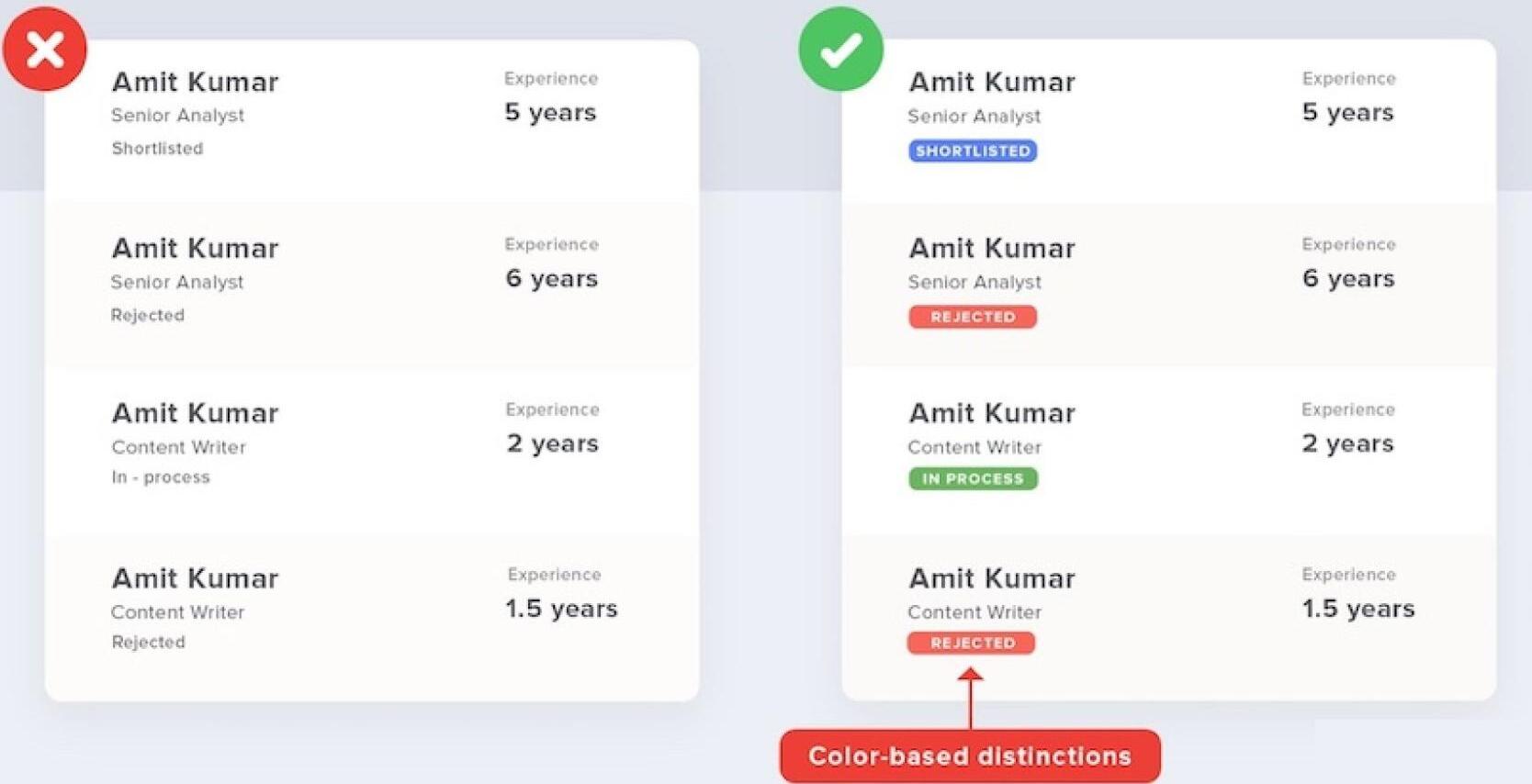
Use Labels Cleverly
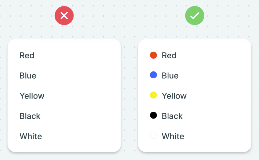
Adding color based
Add color-based distinctions to highlight significant classifications and allow quick visual scanning
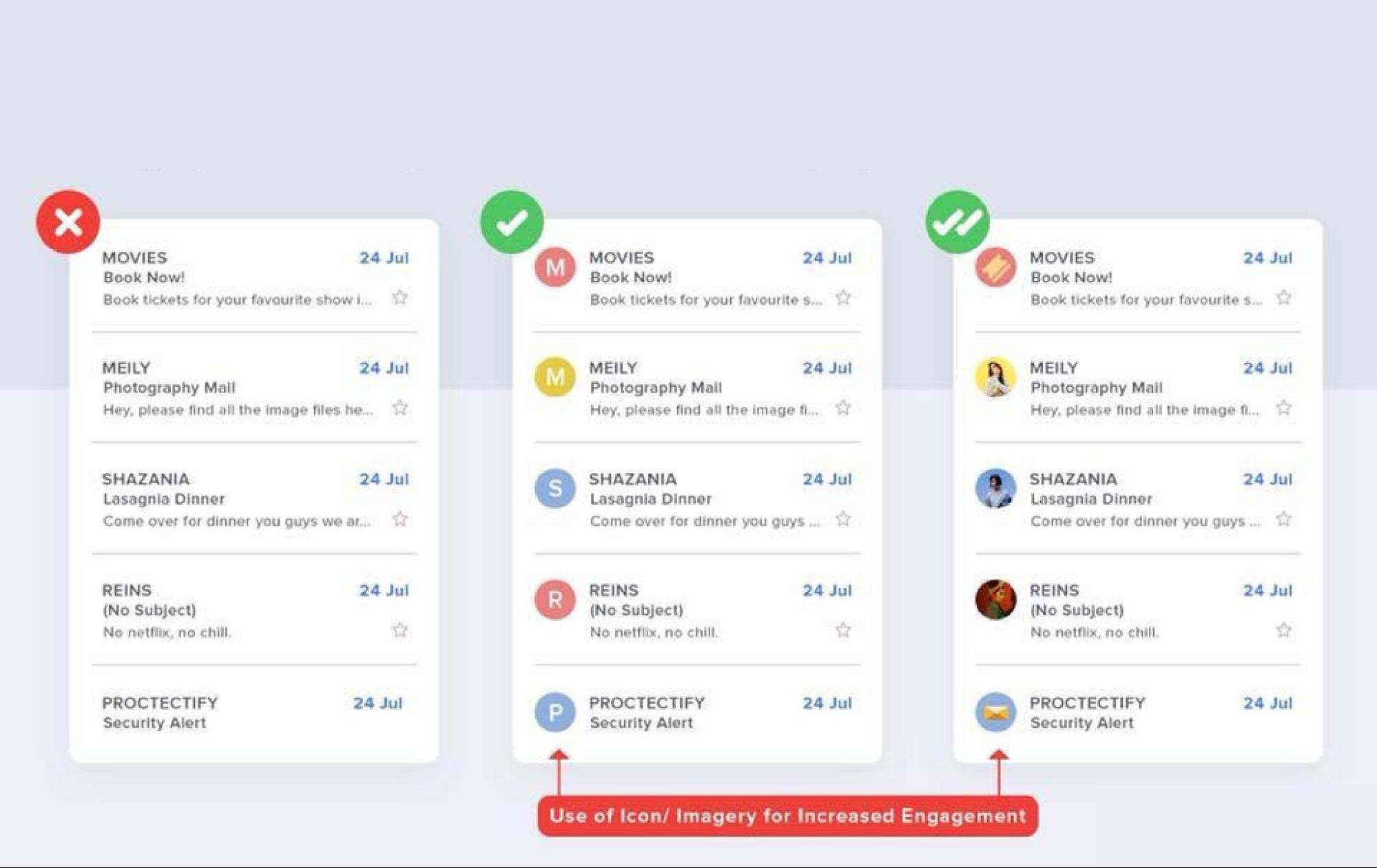
Content Emphasis
Create Content Emphasis with the introduction of icons or imagery wherever possible to increase engagement
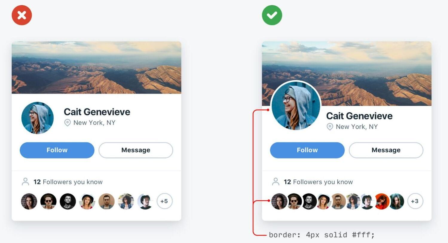
Overlapping images
Overlapping images adds focus & depth to an interface. It is also a great way to optimise space issue.
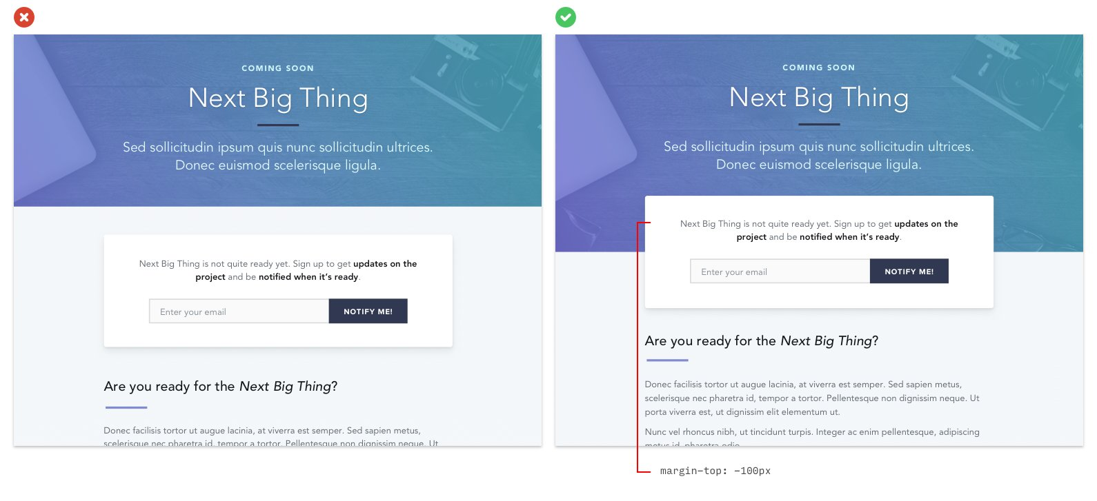
Overlapping elements
Overlapping elements on a page is a great way to create depth and encourage users to scroll
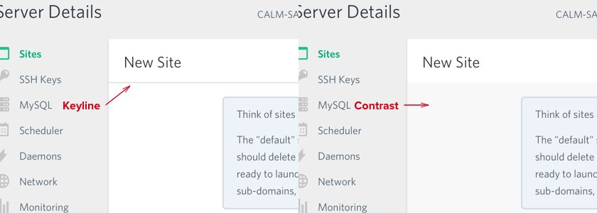
Contrast v/s Keyline
A technique used on panels to distinguish the titles instead of a keyline is subtle contrast:
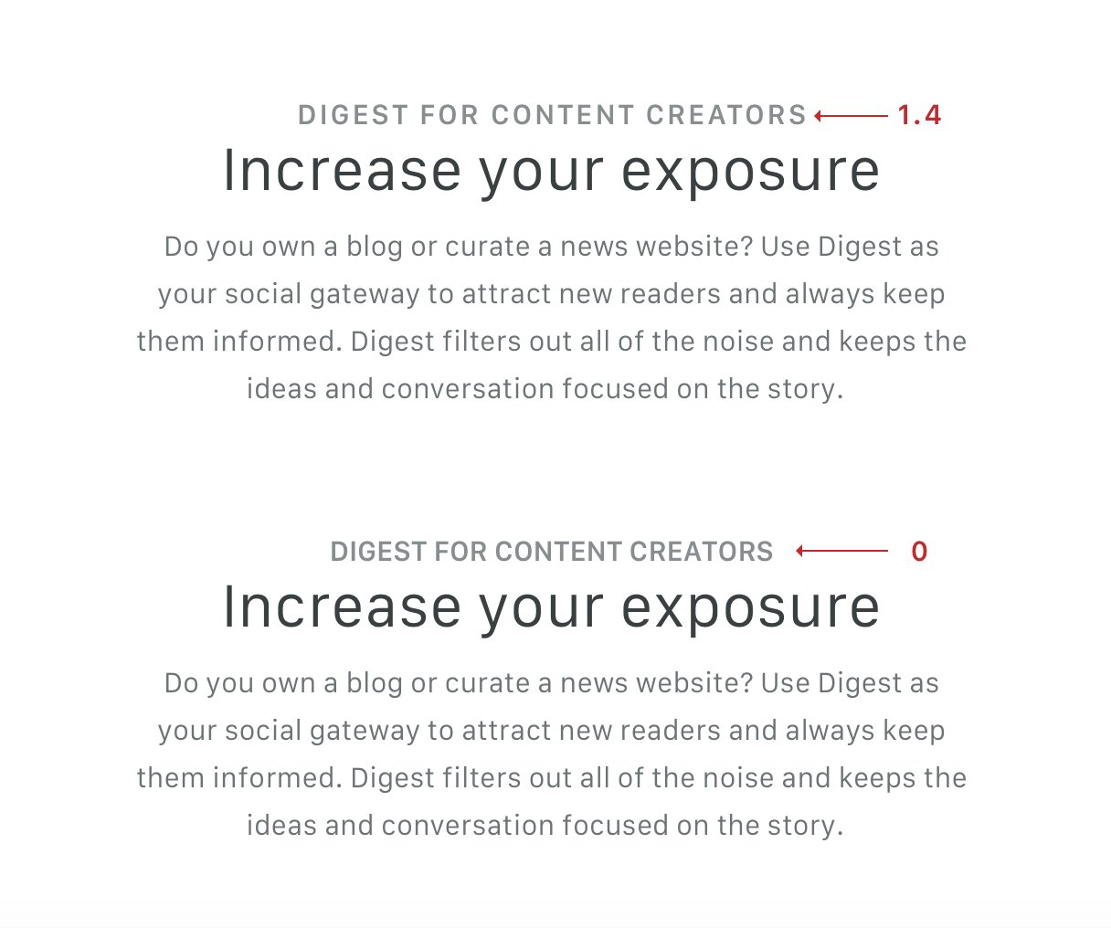
Letter-spacing in all-caps
Quick tip: All-caps can sometimes be difficult to read. Consider using letter-spacing to give your text a little more room to breathe
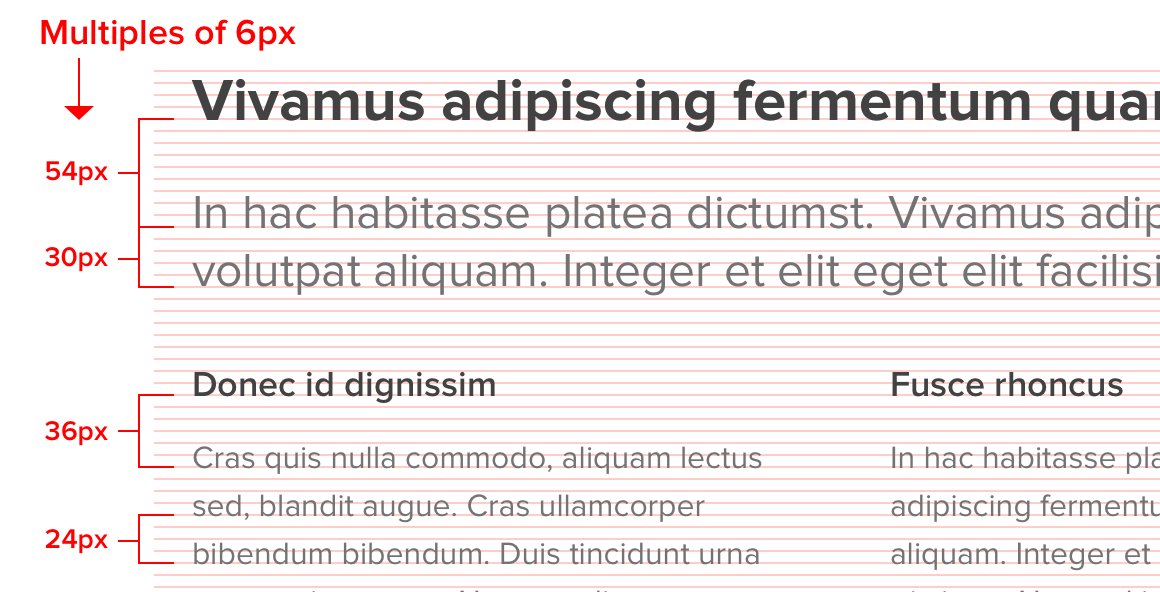
Multiples to define spacing
Using multiples to define your spacing is a great way to achieve vertical rhythm and provides a formula to justify your choices
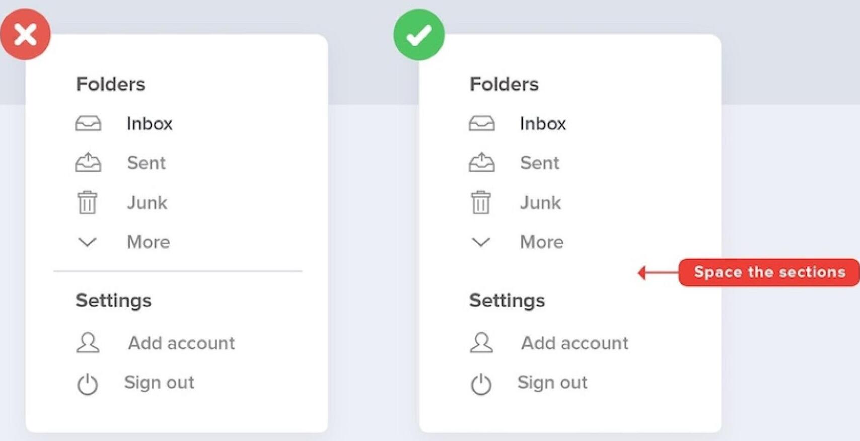
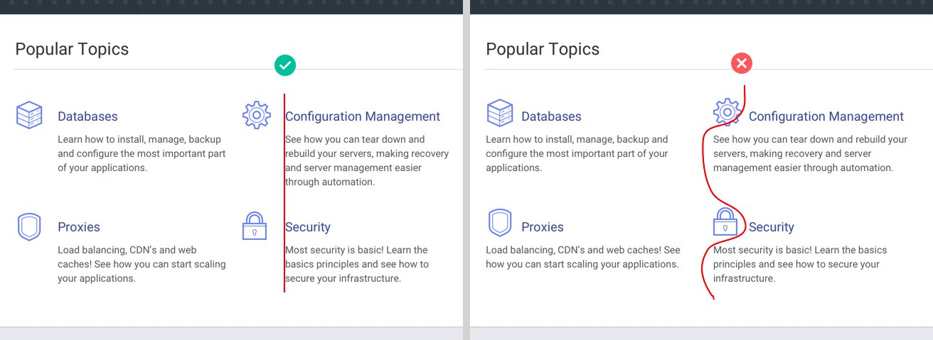
Space the sections
For minimal representation, space the sections instead of introducing a new element such as a line to create a division
Text alignment
Aligning text is an easy way to clean up your design and make your content much more scannable.
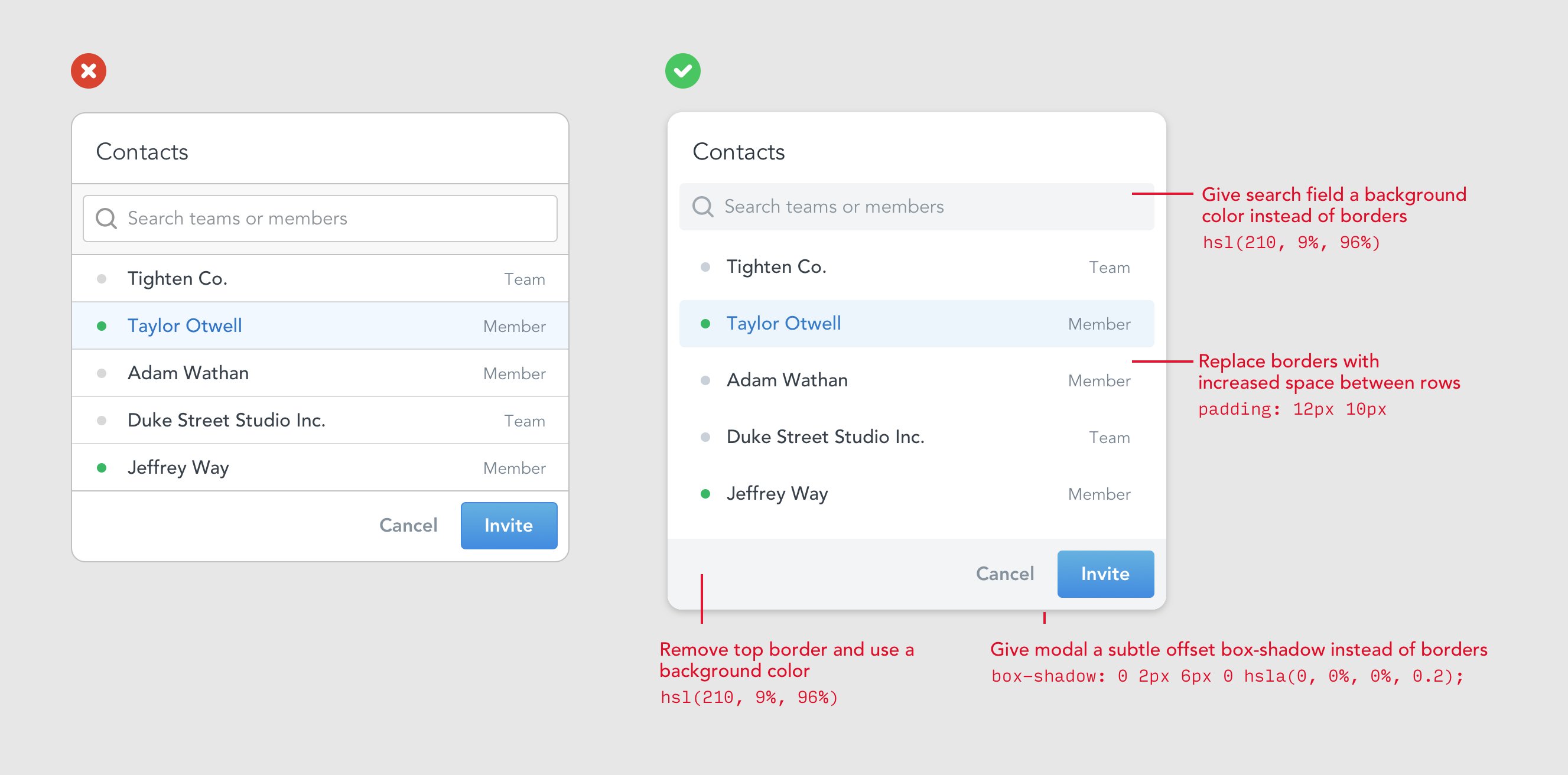
Reduce borders
Too many borders can make a design look really busy
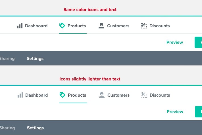
Icon & text
If the icons have more weight than the text, make the icons slightly lighter than the text for inactive states
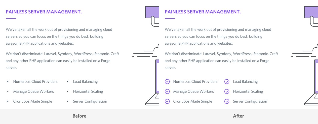
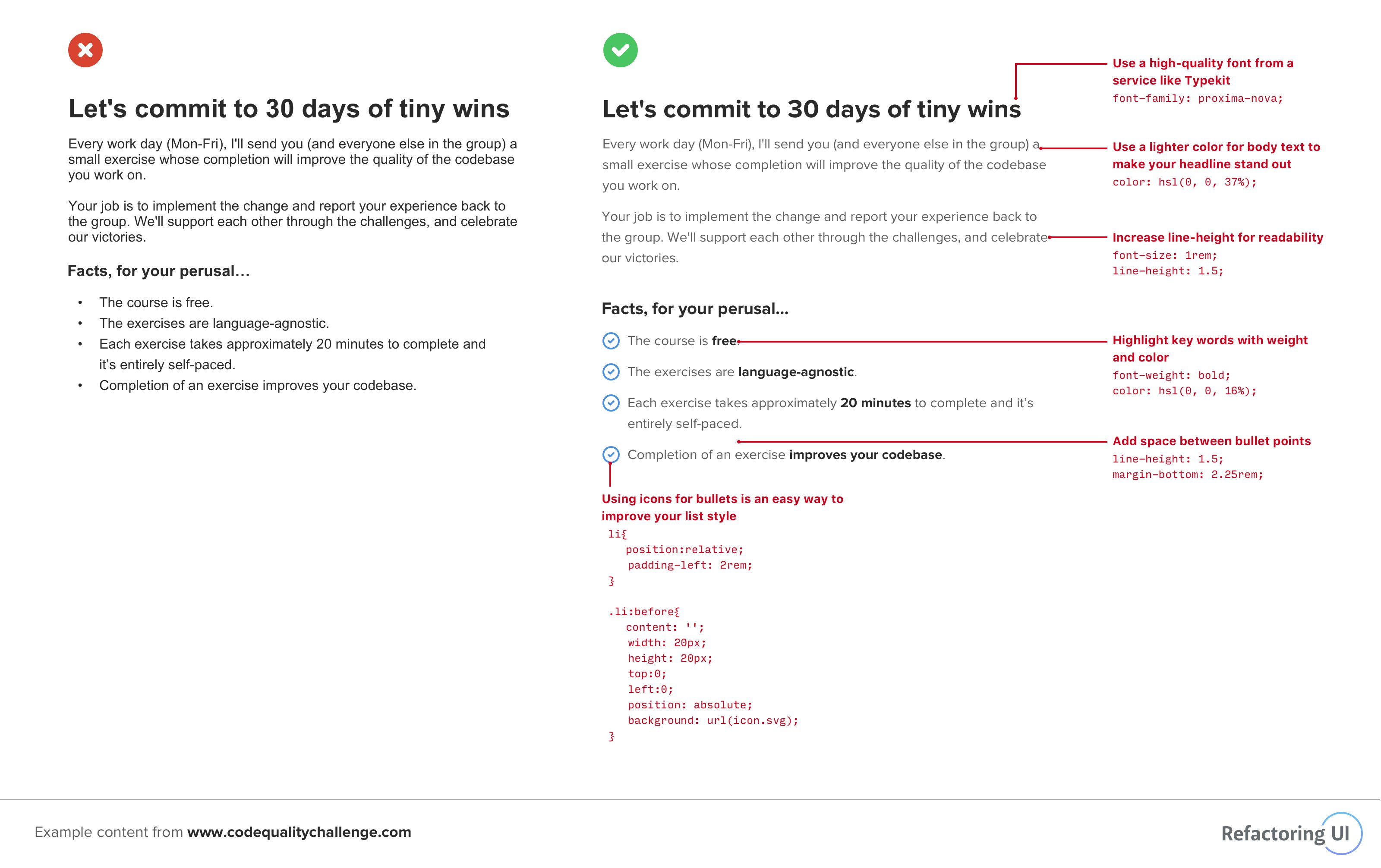
Prefer icons over bullets
Using a generic icon like an arrow or a checkmark instead of the standard bullet
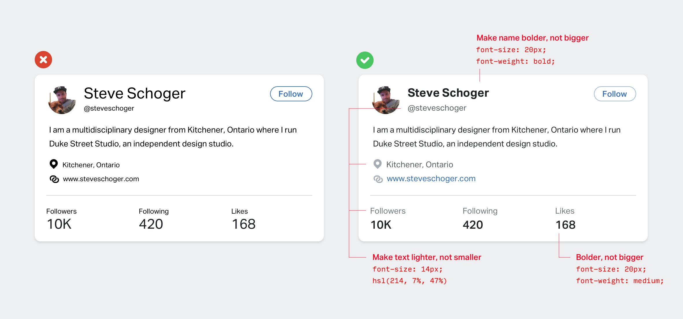
Font contrast vs color contrast
Using color and font weight instead of font size
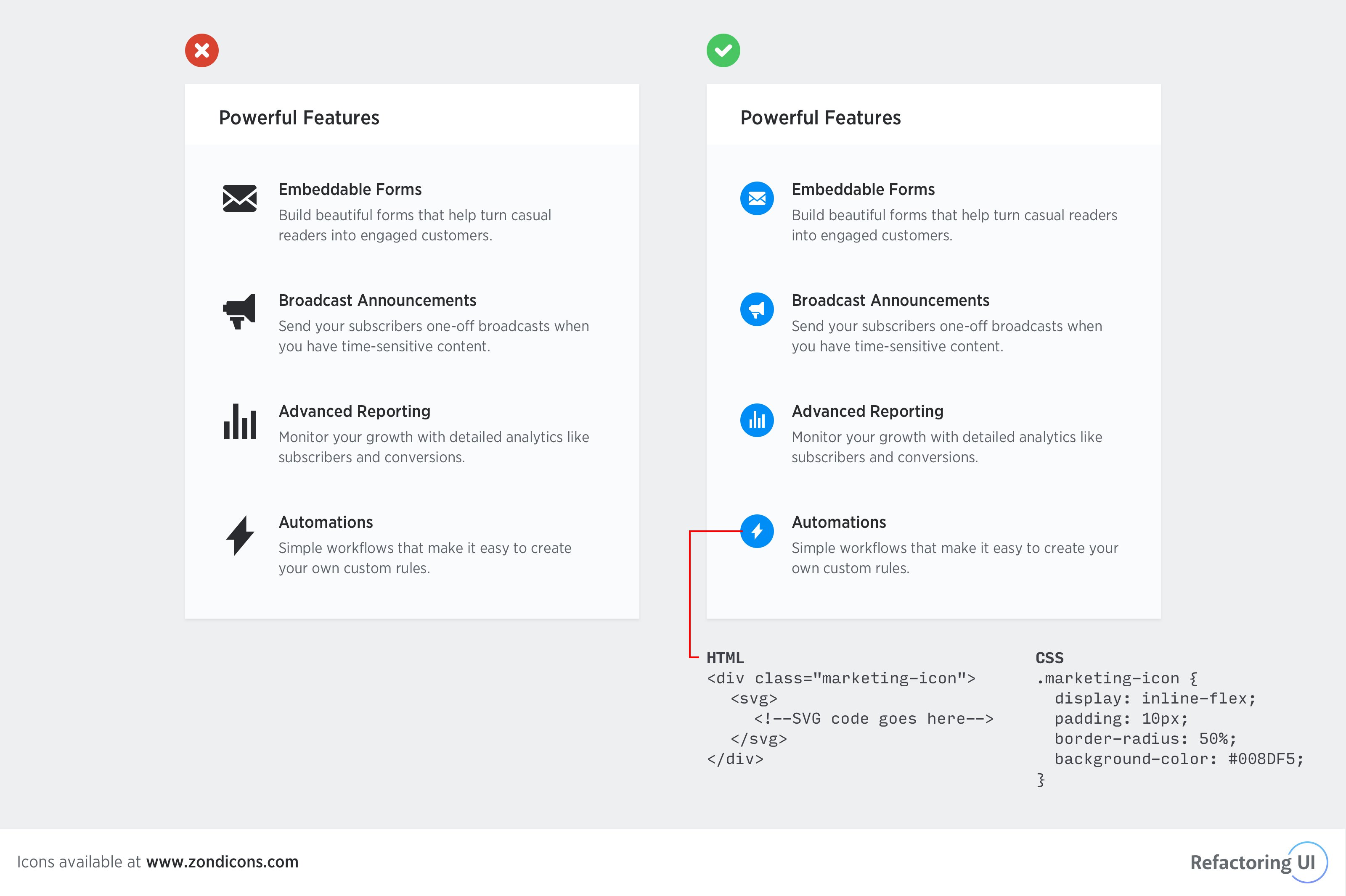
Highlight icons
Giving a background color around icons
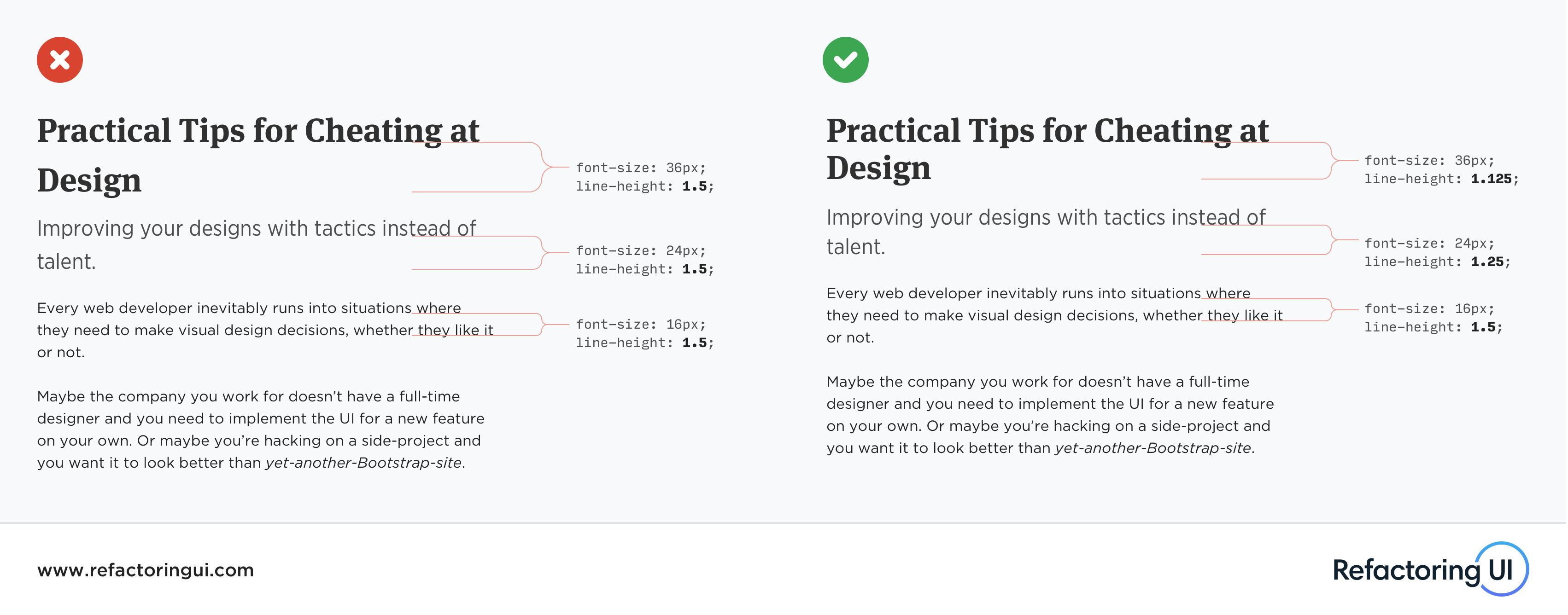
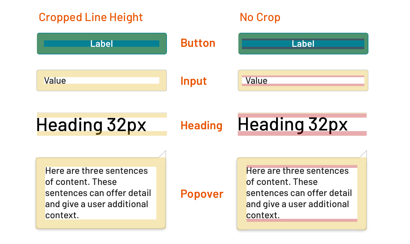
Reduce line-height
Line-height should get tighter
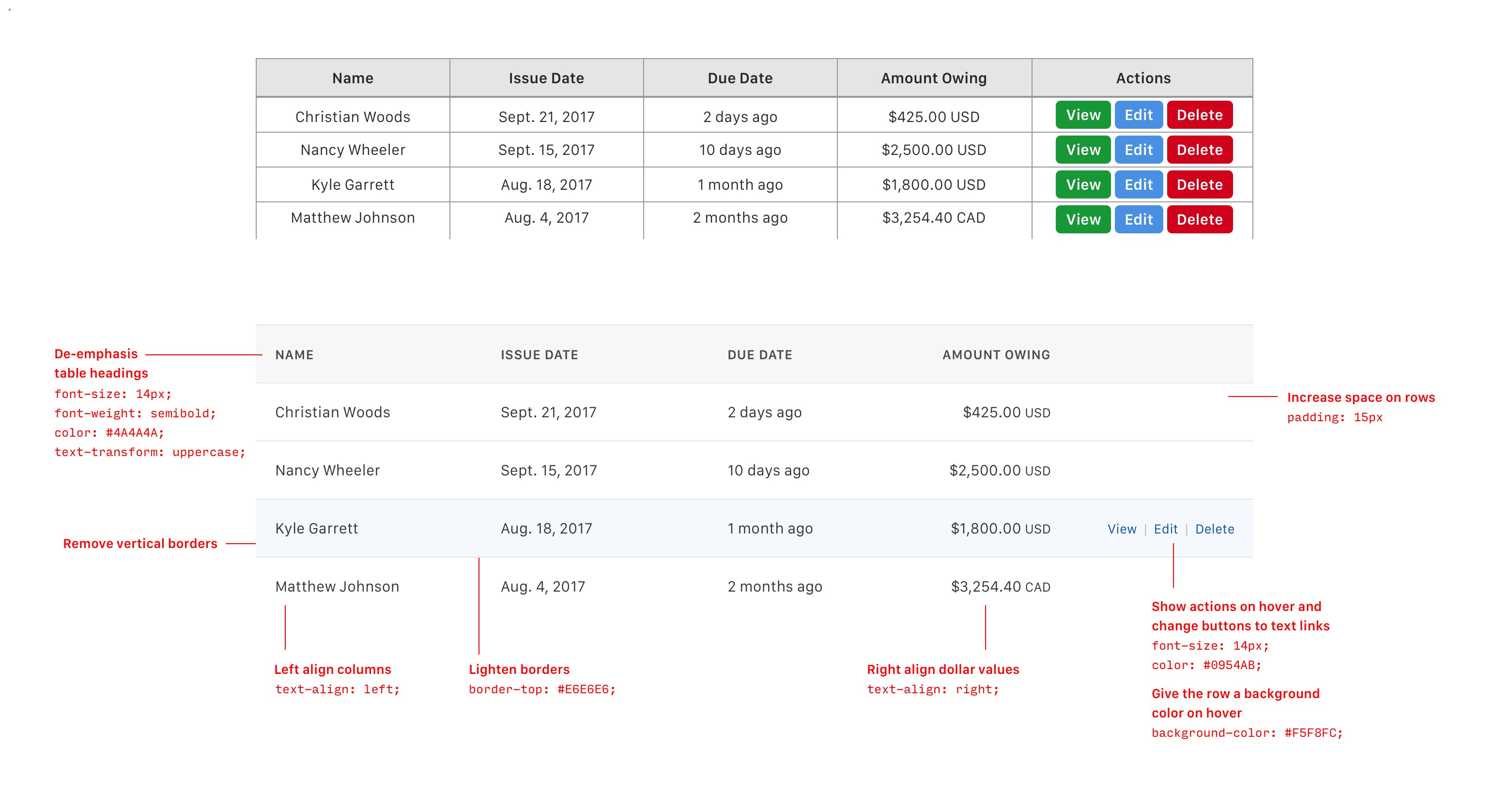
Designing nice tables
Table content that should be left-aligned
- Text
- Identification numbers that will not be added up. E.g.- ID
- Column spanner content (a column spanner is the header that spans a few headers below it)
Table content that should be center-aligned
- If all textual data in a column has the same number of characters and this number is at least 20% less than header text
- Icons
Table content that should be right-aligned
- Numbers that are usually added up, to the decimal point
- Year
- Date
- Time
Natural borders
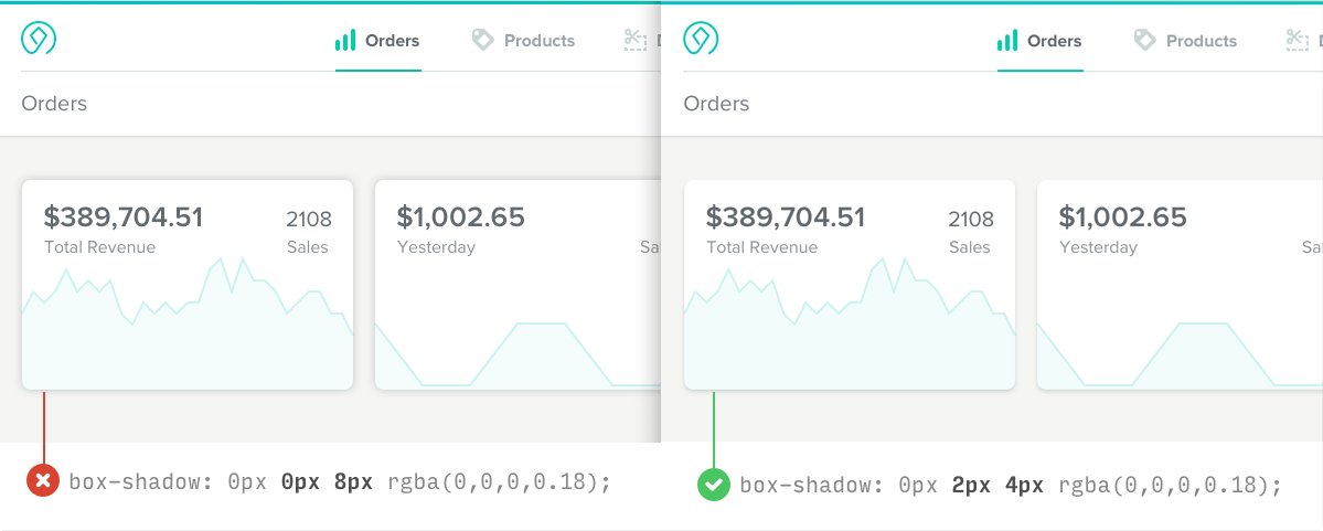
Giving your box shadows a slight, vertical offset helps to make them look more natural
Better text hierarchy
Ideas for Styling content
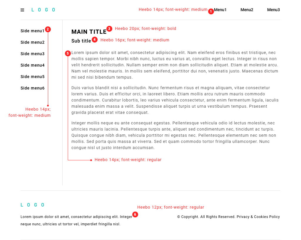
Typography Tips
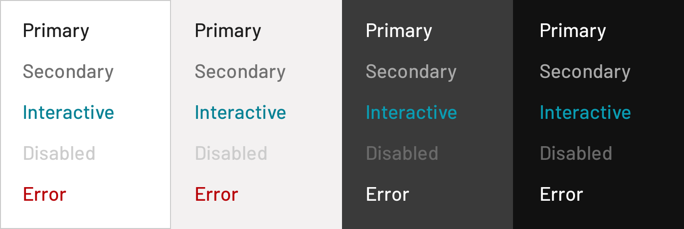
Text Colour
Line Height
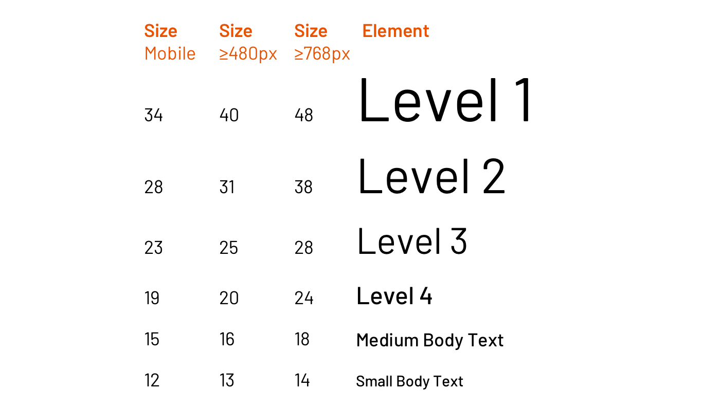
Responsive
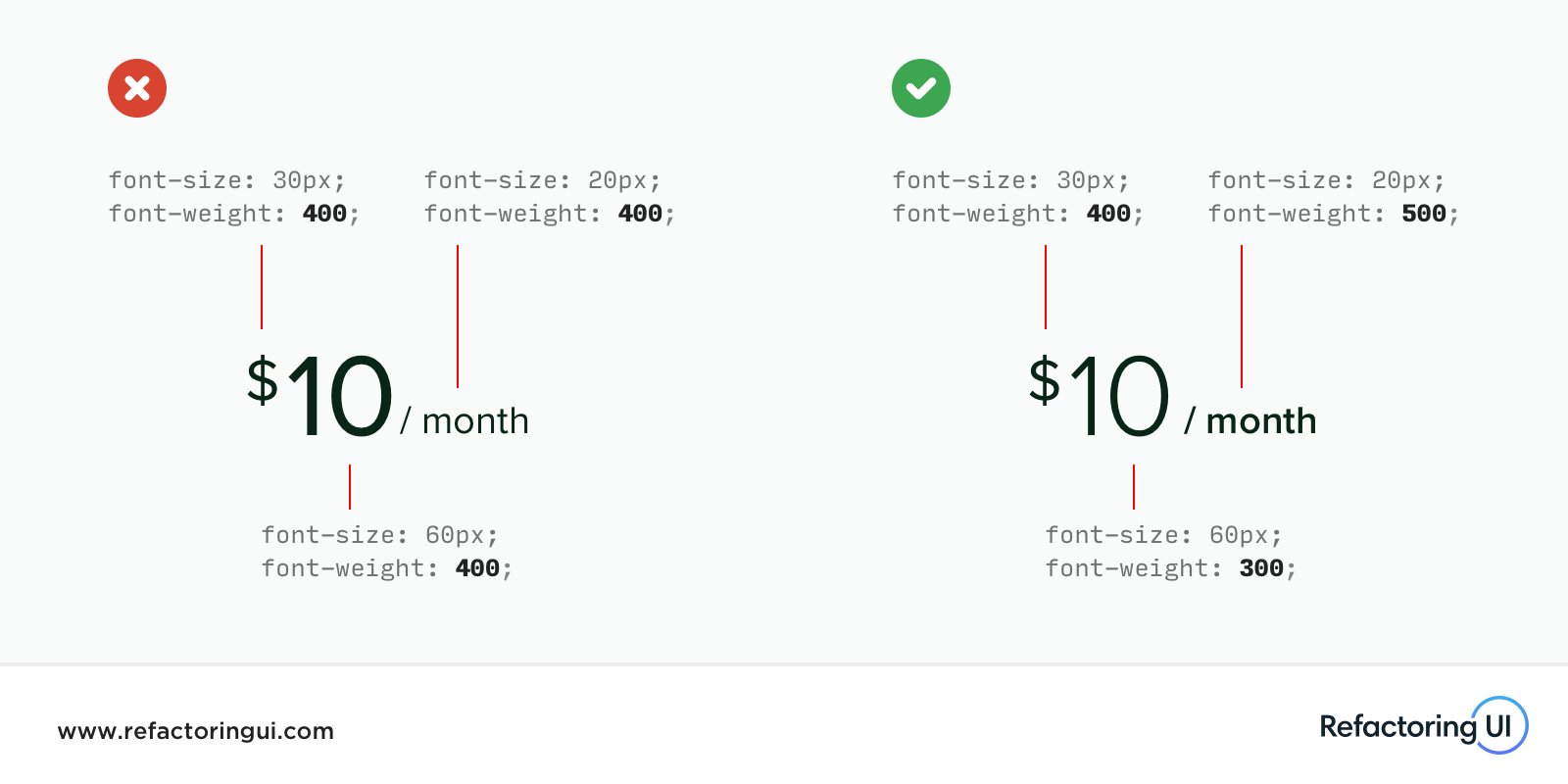
Font-weight aplication
Text of different sizes to feel like the same weight, make larger text thinner and smaller text bolder
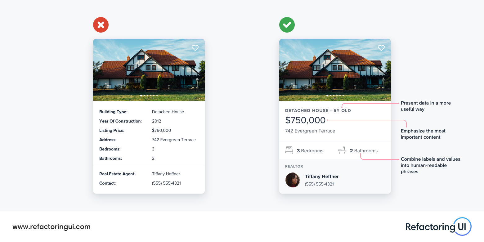
Information hierarchy
Ideas you can use to present "field: value" data in a more interesting way
Use hsl
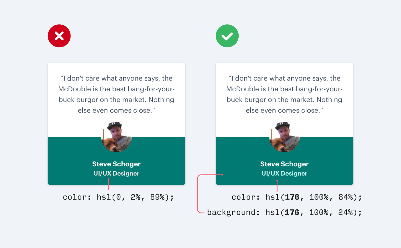
Don’t use grey text on colored backgrounds
Accent borders
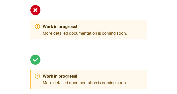
Use accent borders to add color to a bland design
