Form Design
Perfect input fields
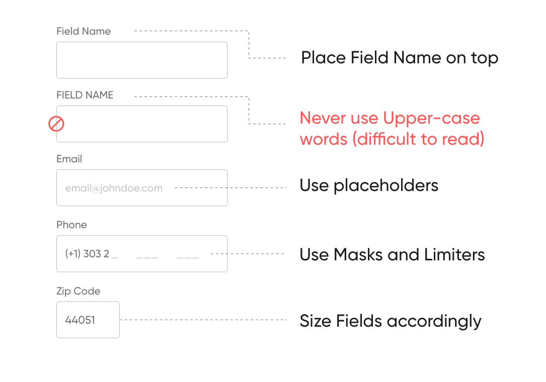
Input Fields are part of every form UI, here are some tips and tricks to deliver better Input fields.
- Use radio buttons for gender types, don’t be afraid using icons
- Use labels with text of currency for finance fields, auto separate thousands and millions
- Design obvious field for mobile numbers, days of week, dates, etc
- Use advanced search with auto-suggestion in case of location/address instead of many field that user have to complete manually
Form layout
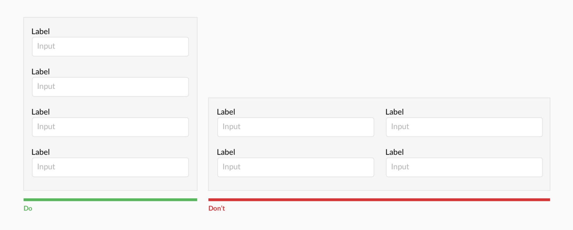
Forms should be single column
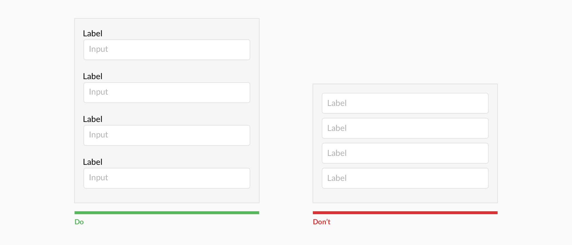
Use labels
Resist using placeholder text as labels
Label layout
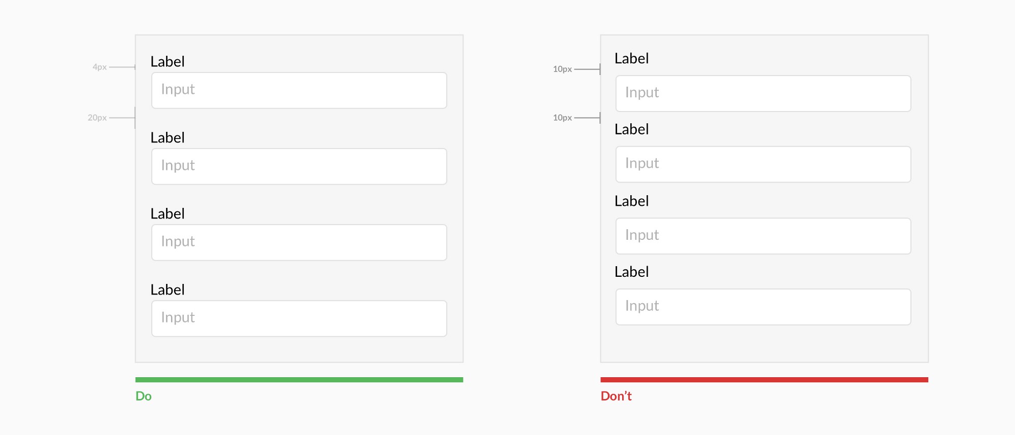
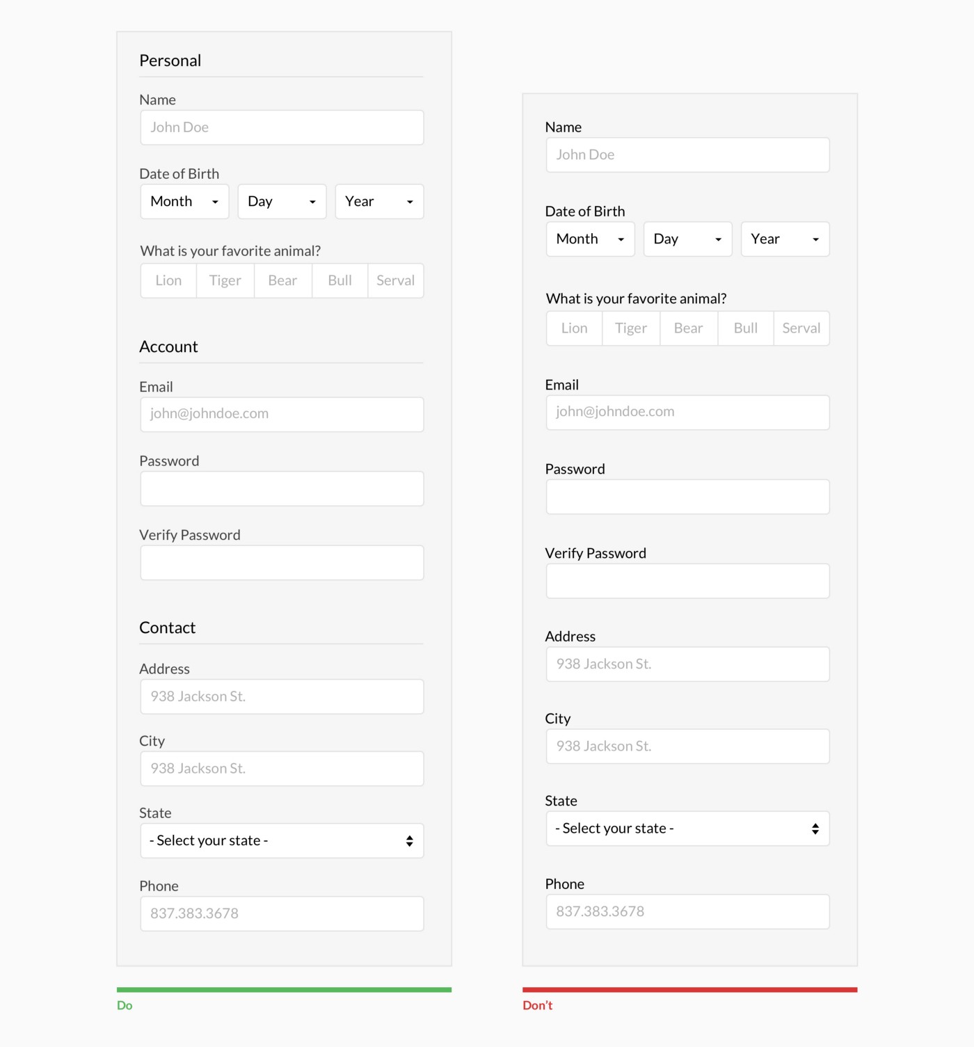
Always top align labels and group labels with their inputs
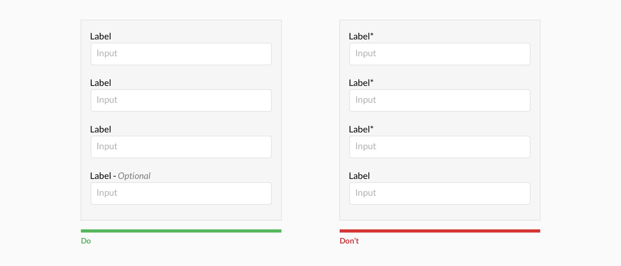
Optional labels
Ditch the * and denote optional fields
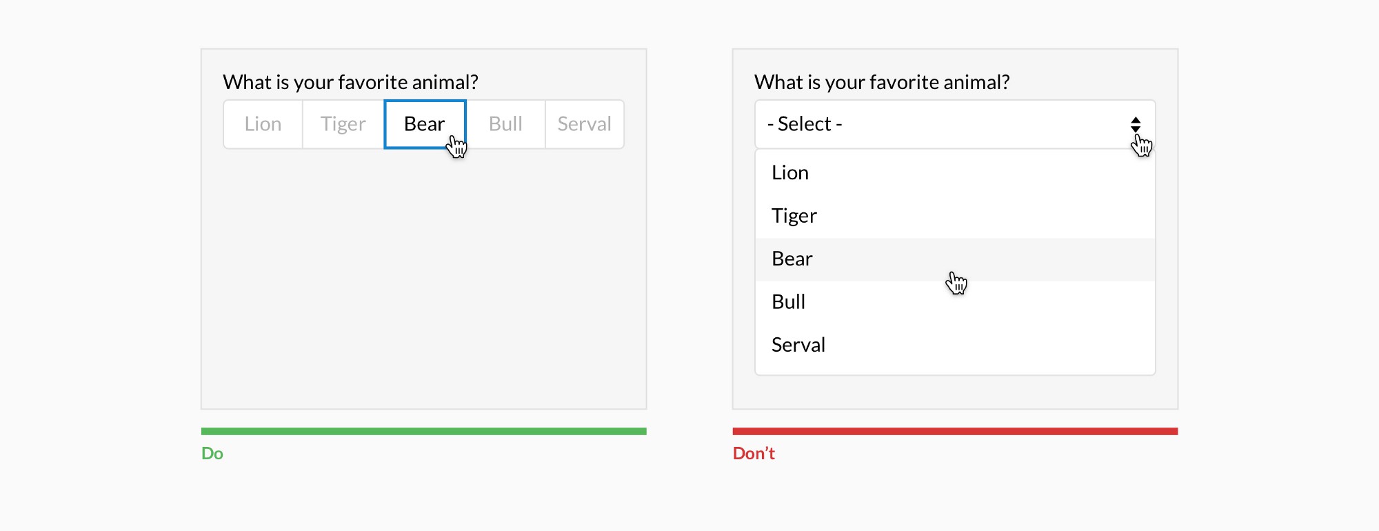
Select options
Show all selection options if under 6
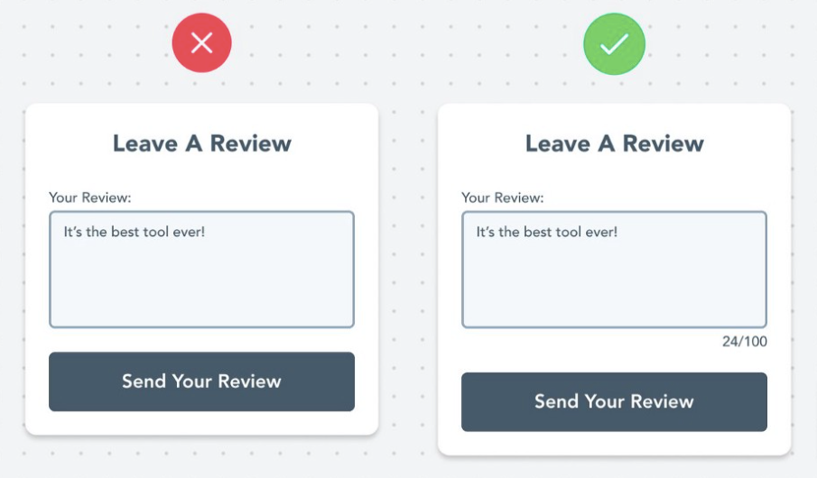
Highlight Limitations
Most fields have some kind of limitation. Character limit, number/date range, phone number, etc. Make users aware of limitations beforehand to prevent their frustration.
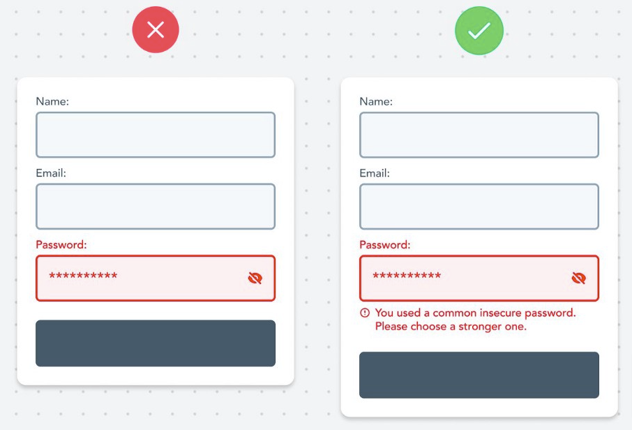
Descriptive Error Messages
Always describe the error with in-depth details and help people overcome them.
Inline validation
Use inline validation after the user fills out the field (unless it helps them while in the process)
Call to action
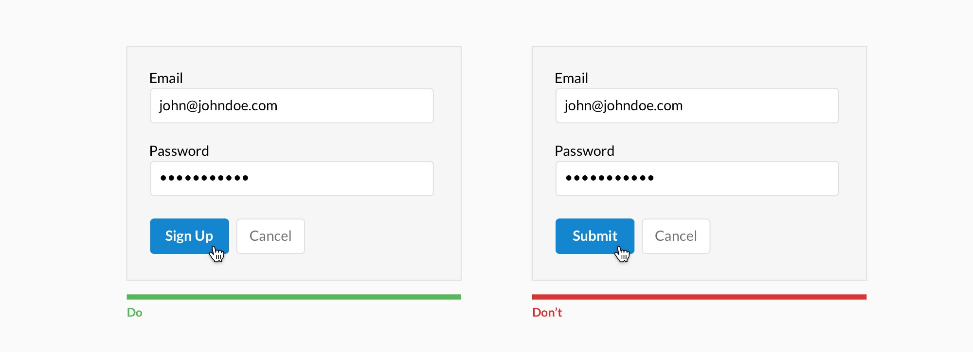
Make CTAs descriptive
Actions types
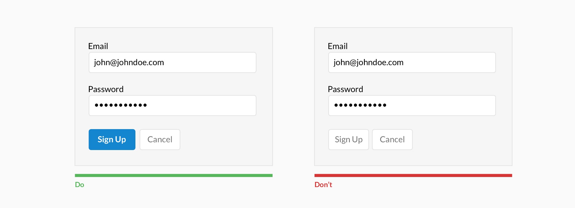
Differentiate primary from secondary actions
Negative actions
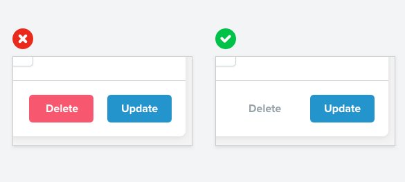
A subtle link for negative secondary actions often works better than a big bold button
Action position (small)
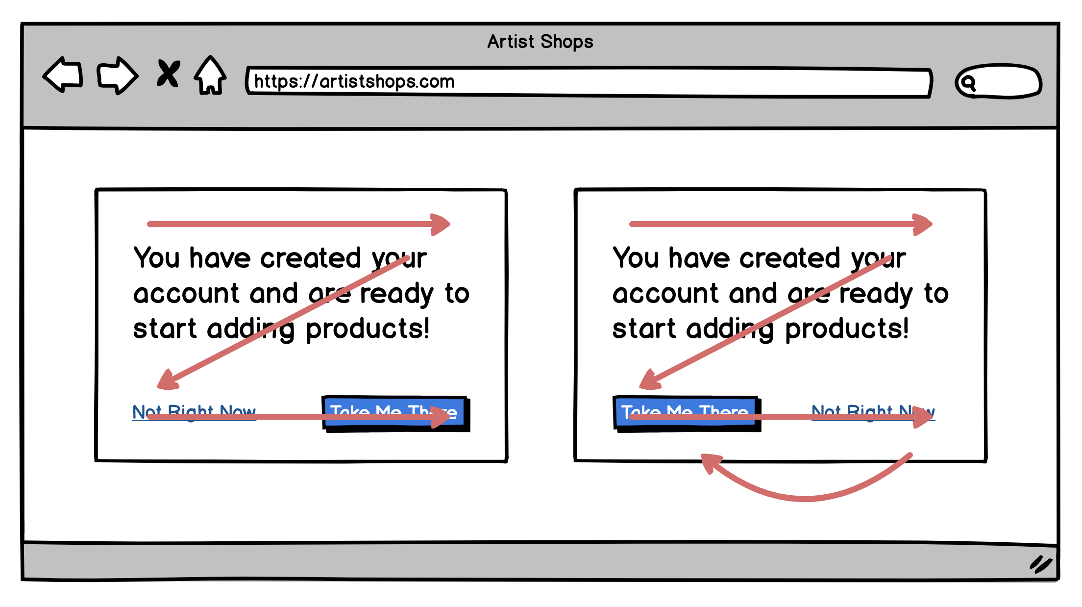
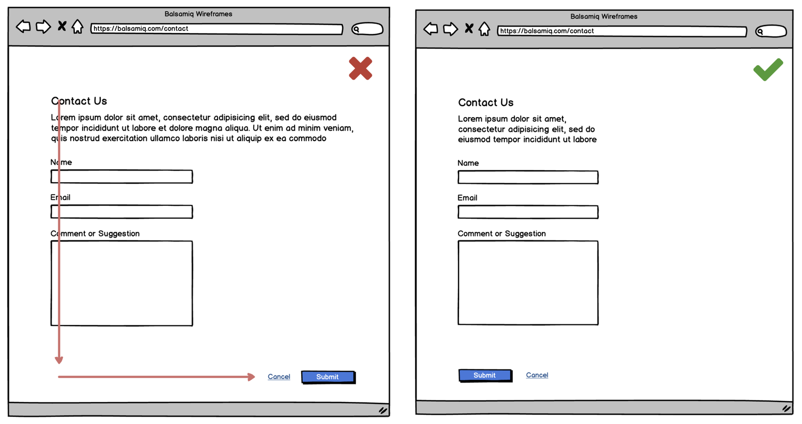
In small windows, the primary action button should be placed at the bottom right
Action position (page)
Full page designs should have the primary button on the left side of the page
Grouping
Group related fields
Wizards
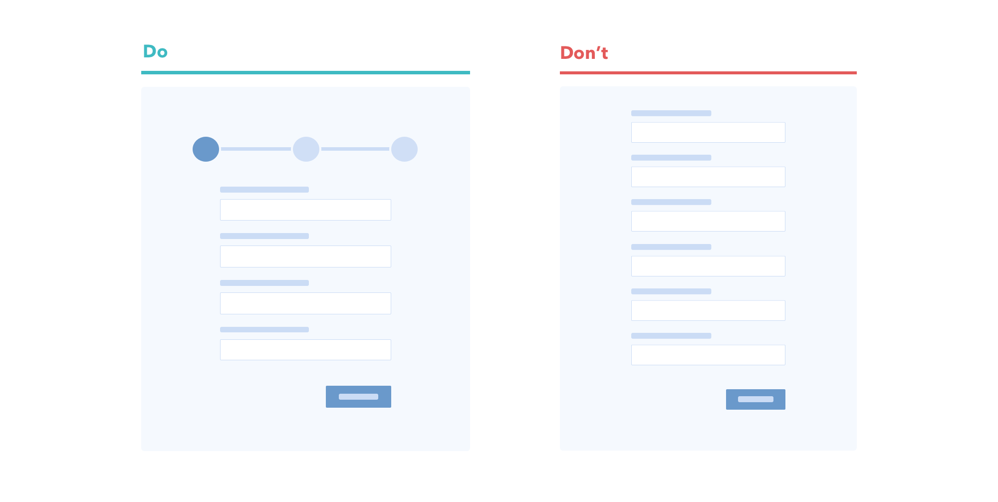
Use wizard for long forms and progress bar
Rich UI
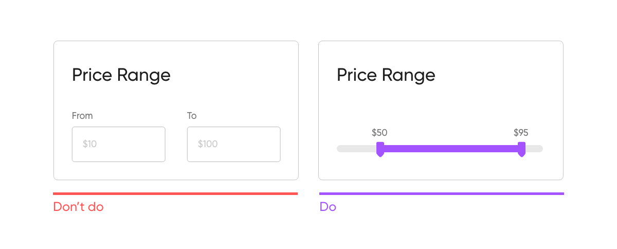
Avoid writing when possible
